Good day, and welcome to possibly the first in an annual series. Or actually the second, since I panned the Jets’ unis last year and this is along the same vein.
A whole bunch of teams changed their uniform layout this year, so it’s only right that we go over them all and mock rank them, just like every other semi-legitimate sports site is doing. I’m not Paul Lukas and this isn’t Uni Watch, but I have strong opinions, dammit, a platform to voice them, and a backlog of House of Pain that I continue to be far too lazy to sit down and actually write until the academic year is over and I don’t have to spend five hours a day on unsecured video chats.
We’ll go in alphabetical order, as there are seven teams to go through, and I feel like using the rating system from Homestar’s Pumpkin Carve-nival. It’s the optimal system, as you can see below.
As with any other aesthetic critique, take it with a block of salt because in fairness you could think that the greatest uniforms in the world are the 1999 MLB “Turn Ahead the Clock” uniforms. I mean, you would be wrong, but it’s technically possible. (Apparently those games were set in 2021, so you know, next year we’ll have the Mercury Mets.)
Atlanta Falcons

The good: Welcome back, a non-retro black! If any teams can/are allowed to do all black, the Falcons are one of them. And the retro Dirty Bird-era unis are fine as a retro alternate, but I’m wondering if they had given it black pants and made it the Color Rush/TNF option. Instead I imagine that that will be filled by an all-black look.
The bad: The continuation of the “city name in probably too big of a font” styling, to my knowledge started by a below team on the list. And then was brought to its illogical extreme by Michigan State.
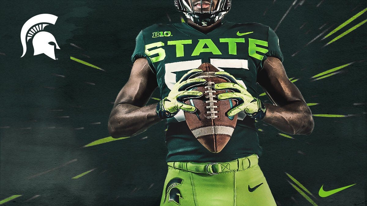
Plus, then we’ve gotta abbreviate it, because as we all know Atlanta is The ATL. Which is at least a slightly different and uniquely Atlanta take to it. It might work on the red alternate better.
Speaking of, I was going to say the red looks bland and for some reason the lower part of it didn’t pop. Which is because after a better look, it’s a gradient. Which looks slightly better when a dude’s arms aren’t in the way, but…

…yeah, no.
The thoughts: As far as having that “ATL,” the mismatch color between wordmark and number on the black and white unis don’t sit great with me. Neither does the all white, so I hope they don’t use that option, I think the road whites work better with black pants. As I mentioned on the red unis, not a fan. Still better than the Jags’ gradient helmets, but that’s not exactly a compliment. Also the font for the numeral 9 doesn’t sit well with me as being about one step up from the Bucs’ digital dummy numbers. Plus for bringing back a black and presumably making that the primary, minus for almost everything else.
The verdict: “I concur. Worst place. Ding!”
Cleveland Browns Pauls
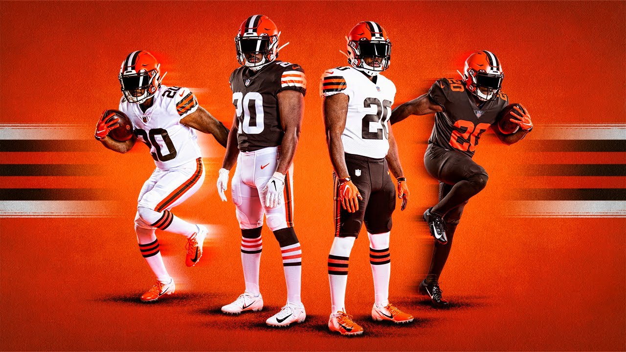
The good: Oh thank god they removed “Browns” from the pants. Instant improvement. Additionally the removal of the “Cleveland” on the jersey to help clean everything up. No frills, very basic, very classic.
The bad: The brown Color Rush choice, all brown with orange numbers. (If one jersey had the city name or something like that, I’d say the Color Rush jersey could, similar to the NBA City Edition unis, especially with people in Cleveland calling it “The Land.” As opposed to everyone outside of Cleveland calling it “The Mistake.”) Maybe a white outline would better delineate the numbers, or something. Call it the brown-headed red-headed sheep of the family. No, I don’t know any red-headed sheep, that’s the point.
The thoughts: Pretty good. I’m surprised there are no orange pants, because I would think an orange Color Rush would at least look better than the brown-out choice. But 2/3’s not bad, and all things considered, a hell of a lot better than what the Brownies usually do with things.
The verdict: “That sure was nice of you. You get most improved. Ding!”
Indianapolis Colts
Really not a full uni change, the colors and stripes aren’t changing, which would be news and possibly rioting in Indianapolis to match that in Bawlmer when the team snuck out in the first place. Instead it’s changes to the logo and number font and possible plagiarism?
There’s no “here’s every permutation” pic, but this one has the majority of the changes.
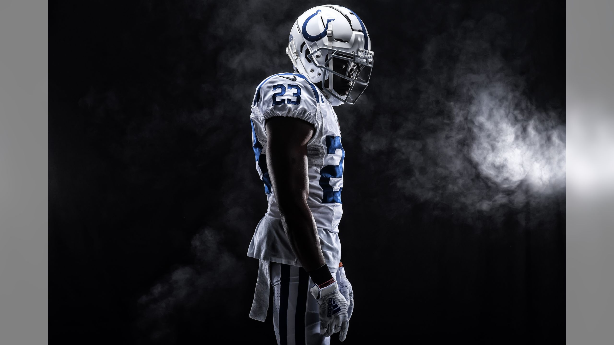
For the rundown, it’s a tweak to the number font to match the new logo, which is also on the helmet bumper; and on the white jerseys the Nike swoosh is the new tertiary color, called Anvil Black. There’s also apparently a slight tweak to the curve of the horseshoe, which had been subtly over the years away from the primary logo, back to match the primary logo’s arching—similar to the longtime difference between the old English D on the Tigers cap and jersey.
The good: I like the idea of matching the number font to the logo, especially because it’s the serifs of the 2s and things like it. I don’t think it’s perfect which I’ll expand upon in the thoughts portion. And realizing the discrepancy between the helmet and the primary logo and fixing it is obviously a good thing, although it’s not as noticeable when only the former is worn on gameday.
The bad: The necessity of Anvil Black on the uniform means you know they’re going to make an all-black jersey. To gratuitously steal from Uni Watch, this is what is called BFBS, or black for black’s sake. That’s the only reason to add it as the swoosh color, the 90s-2000s idea of everyone needing a black alt, because keeping the blue swoosh makes a hell of a lot more aesthetic sense for the road whites.
The thoughts: As I said, I like the idea of matching the number font to the logo. However, if it were my pile of Irsay-brand drugs I would have matched the new font’s, and then the number’s serifs to the horseshoe. What I mean by that is that I would have curved serifs to match the horseshoe curve. Especially on the secondary C, which has the matching grommets to the horseshoe.
Also your word of the day is officially serif.
The verdict: “Not last place. (Ding!)”
San Diego Chargers of Los Angeles of BOLTMANaheim
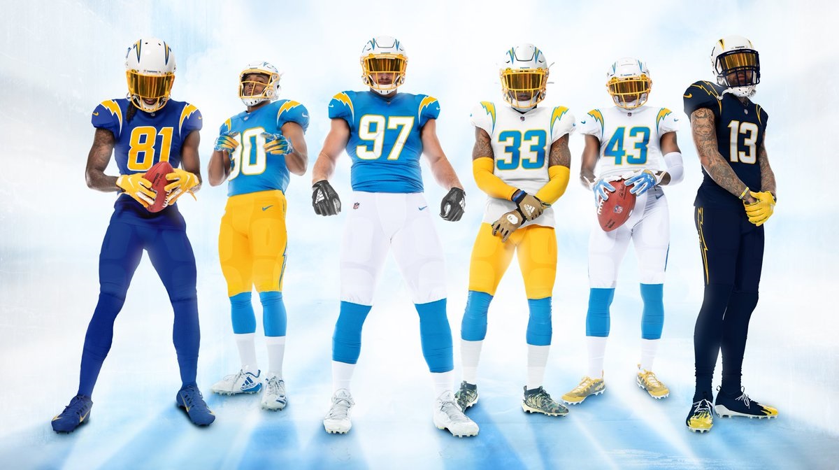
The good: It seems like there’s something for everyone not trying to string up Spanoi. The powder blues remain, though from this picture they look maybe a little less powdery and a little more azure. The navy blues return as their retro alternate/Color Rush option. The Color Rush option I assume will be the… I don’t want to say electric blue because I value my femurs, but if I were a betting man that’s what they’re called. The number on the helmet, and the outline of the bolt, will match the jersey, which I appreciate, because that’s doing the little things right. Better angles here.
The bad: Of course there are little things, such as “How close to the powder blue is this new, more azure-looking color, or is that just a trick of the light?” (It actually does look pretty similar when I saw an ad for a Justin Herbert jersey for sale, so strike that one a bit.) Or “Wouldn’t the navy unis work better with its own white pants version, rather than as all-navy? And why does it have a navy bolt rather than navy outline with the yellow bolt, both on the helmet and on the pants?”
The thoughts: Much to Low Commander’s rage, these remain good uniforms. At the very least, they’re the best-looking football team in the city, and the best-looking team with the initials LAC. I’d say they’re not necessarily the best-looking team in the city though, since it’s tough sledding with the Dodgers and Lakers.
The verdict: “Now that’s talent! Good prize! (Ding!)”
Los Angeles Rams
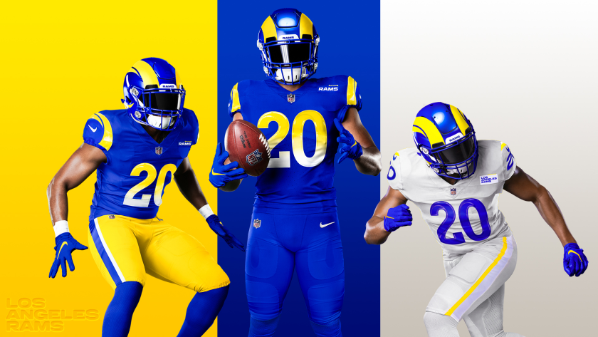
There is a lot to unpack here.
The good: The yellow is here to stay. The 00s gold is gone, the white ram horn on the helmet is gone, the unsureness of “what are our colors are gone.” The numbers have their own ramhorn inlay to them, which is pretty cool. I think it’s better on the white (sorry, bone) jerseys because the blue numbers show it more distinctively.
You guys, I realize why the helmet has that weird segmentation! It’s supposed to look like a ram’s horns from the side, so it’s supposed to be a three-dimensional concept in a two-dimensional space. Okay, someone was thinking here.
The bad: Oh, where to begin? For one, as I said with the Falcons, the gradient doesn’t fucking work, whether on the shirt or the number, and especially combined with the horn inlay in the numbers it’s doing two things which gives the effect of zero. The road bone pants (hehe, bone pants) seem like they’re missing a stripe or something, because the yellow and white don’t really show well on the pants. (Still giggling at “bone pants.”)
Then there’s the side details. The home blues have no TV numbers, opting for the sunshine/ram logo we’ve already mocked (they needed permission for that btw) but the road bones have TV numbers. Which look like they got squished.
And then there’s the shoulder nametag. One, it looks stupid to just have your name, not your logo there. Two, it looks even stupider on the road unis, because the bone-colored jersey has a white nametag. Three, it says “Rams” on the blues but “Los Angeles Rams” on the bones. Did two different design teams work on these, where each group took one and there was no communication apart from an initial rubric of the colors and the inlaid numbers being a thing? Anyway the nametags remind me of this.

Oh yeah, and that ram charging head-on? Points for the attempt, but loss of all those points because it doesn’t look good at all. And it only is seen at an angle? Also aren’t the outside of ram’s horns made of keratin, not bone? And thus darker than off-white?
The thoughts: Oh, bless their hearts, they tried. And there are enough good ideas that with some tweaks this could be a nice jersey! The ramhorn inlay on the home blues? Take away the gradient and it might be visible and pretty cool, like it is on the road unis. Road jerseys that were off-white enough that they needed permission to run them? I mean, the baseball fan in me appreciates retro cream jerseys, so same thing, right? Attempts to show the third dimension? Could work.
But then there’s the gradient. And the TV number fuckery. And the nametags. Oh, the nametags. Which will be replaced with shoulder ads within five years, probably three.
They tried. But they tried too hard, and now Eric Dickerson says they’re soft and the helmets make them look like the Los Angeles Bananas. Although if the Internet has taught me anything, bananas work plenty well enough to Ram It.
Also one more time… bone pants.
The verdict: “Coach Z, are you a poser?” “Nah man, I’m down.” “Down with second to last place. Ding.”
New England La-Li-Lu-Le-Lo

The good: It’s pretty difficult to fuck up red, white, and blue, no matter what our government does, and the uni was pretty much already in use as the Color Rush, so it’s not that major of a uni change like some of the other teams. So yes, the colors still go well with each other, and the socks look nicer than last year’s mono blue.
The bad: Apparently they fucked up which pant striping is in the 2020 kit, a thin white stripe or the thicker white stripe we see in the images. The answer is the thin white stripe, and the thick-striped pants are the 2019 Color Rush pants. Well, that’s amusing to me personally. So there’s the obligatory and inevitable “TAWMMY GOES AND THE WHOLE ORGANIZATION GOES TO SHIT” complaint by the Quinzee faithful. It’s not like there are other pant options—no, seriously, it’s just the blue pants. No white, no silver (which means apart from the helmet there’s no silver anywhere else on the uniform). Also their previous number font has made way for a standard block number, and I think that’s a step down, because the old numbers had a sleekness to it and, being a custom number font, were distinctly New England’s. The red-blue-red stripe on the road whites clashes with the blue number, which could have been rectified with a blue-red-blue. (Also that’s about the correct thickness of the pant stripe.)
The thoughts: I get to laugh at the pants misstep under the “YOU HAD ONE JOB” rule, tee hee. There is much rejoicing.
The verdict: Just for that: “I call it last place. Ding!”
Tampa Bay MRSAnaries
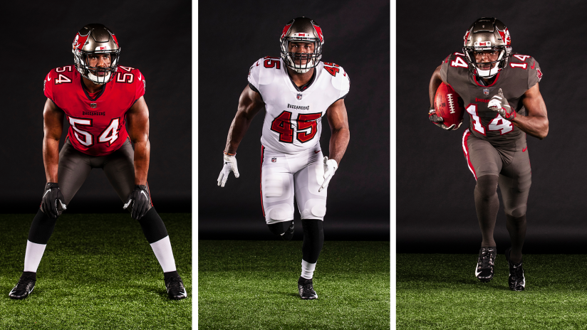
The good: Hallelujah, the alarm clock numbers are gone in favor of a standard block font, as are the two-tone shoulder yokes. And now there’s the addition of a pewter top as a third, because until the one-shell rule is changed I don’t think the creamsicles are coming back. Incidentally, did you know that the Bucs have now had this color scheme longer than the Bucco Bruce years? They changed in the ’97 season, which means this is the 24th season of red and pewter, as opposed to the 21 seasons of creamsicles.
The bad: The flag on the helmet remains obnoxiously large, where the corner of the flag isn’t always visible. Even shrinking it a little bit would go a long way! Block numbers are a step forward, but it seems like a Step 1. Also it might just be the angle but the 4 doesn’t show particularly great on the white unis. The pewter on pewter, even it’s going to clearly be the Color Rush uni, needs something. Would the white pants work with it?
The thoughts: There is definitely a pirate-style non-digital number font out there that needs to be taken advantage of. But Redshirt’s fears of the uniforms reverting to 12:00 after a big hit are alleviated, and in the end, isn’t that what matters?
The verdict: “2nd place. (Ding!)”
That does it for this pajama jammie-jam. Maybe we’ll actually get to see some of it on the TV, because it’s not like there’ll be much else to do. Until then, we can argue about what uniforms are best suck the least?
So I’ve heard that Dr. Fauci is out and they are bringing in a new guy who is on board with the whole “injecting patients with disinfectant” business.
–
The only sane one of the bunch.
To be fair; Freddy was a great night manager.
Did you watch that “Freddy’s Nightmares” show? I have memories of it being a lot of fun; probably shouldn’t ever put those memories to the test.
I only made it through a couple of the movies…. not enough tits for good horror.
So there’s a Community table read going on now.
https://www.youtube.com/watch?v=V6Q_nlSULio
I’m convinced I saw Jim Rash at my local Costco one time so I like to think he lives around here somewhere.
I saw a large Rash at Walmart; pretty sure it wasn’t somebody famous, but maybe well known by doctors.
I have no fashion sense whatsoever, but it seems like the uniform designers are in a USFL updated to mid-90s mindset.
The day in stupid
https://www.nbcphiladelphia.com/news/coronavirus/new-jersey-gym-reopens-in-defiance-of-coronavirus-closure/2399453/
Well, that guy’s an asshole.
Boltman history.
“Or maybe me…pre-history?”
-Hermes
[Nikola Tesla shrugs]